
Commercial
2024
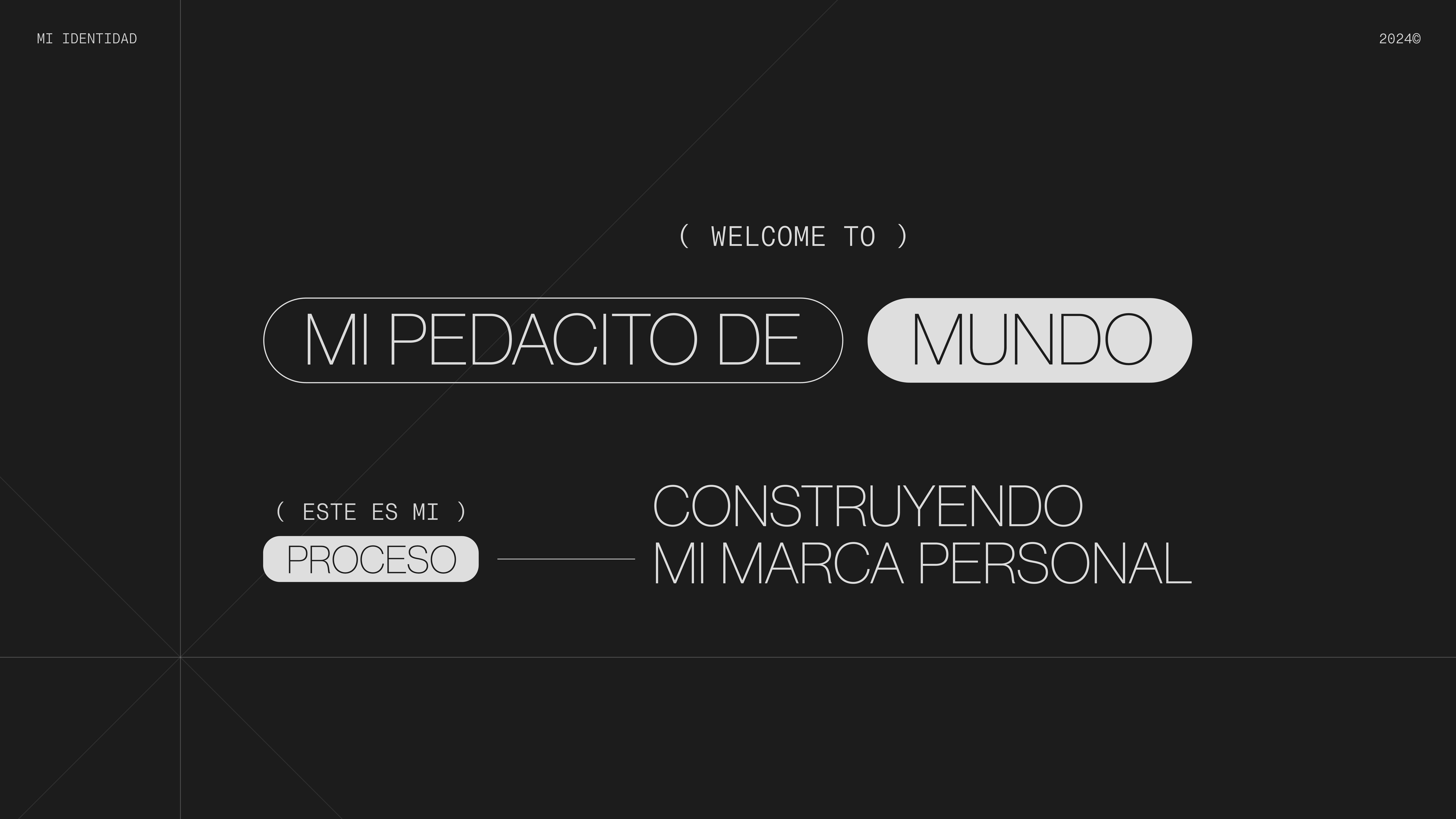
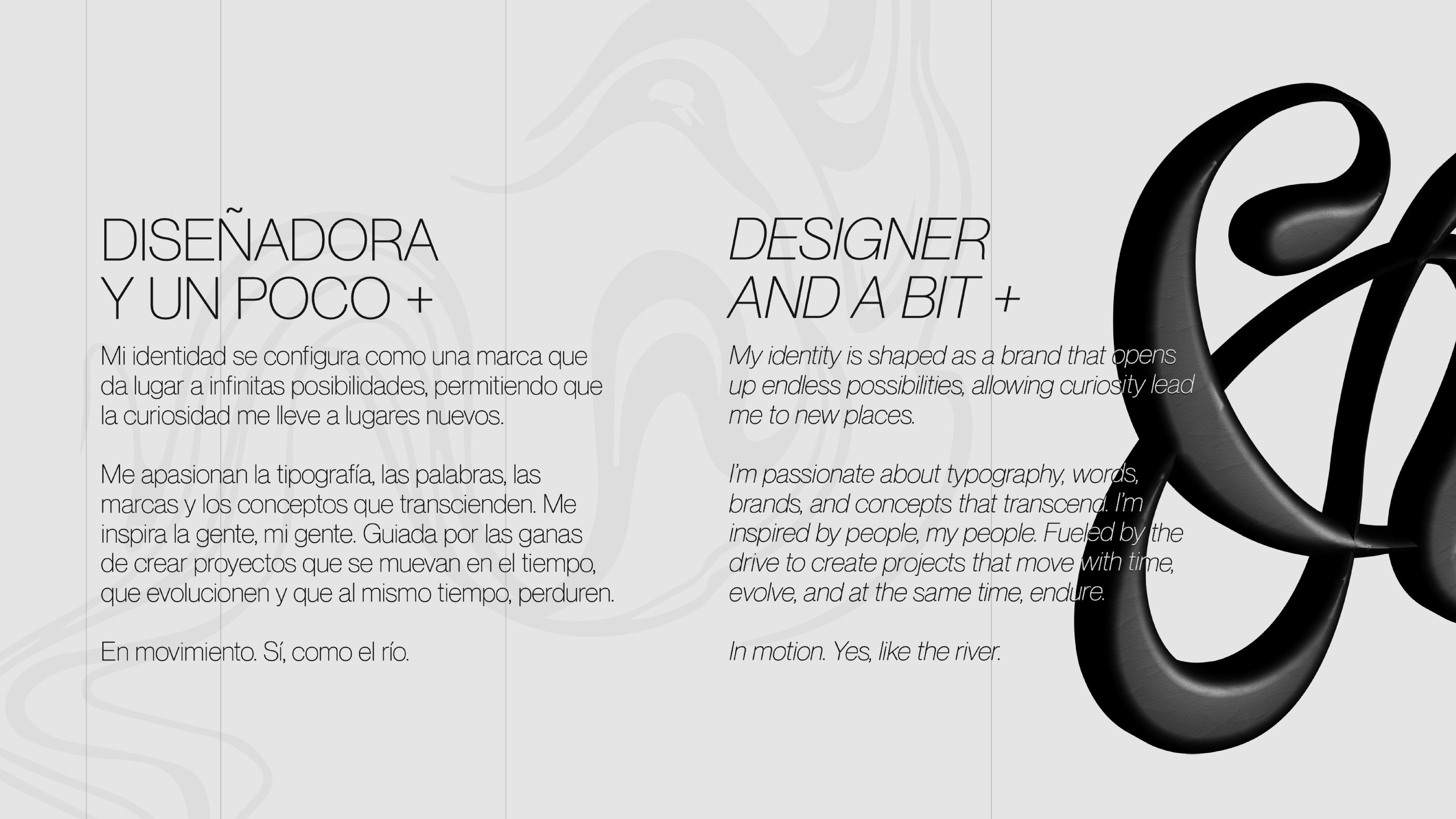
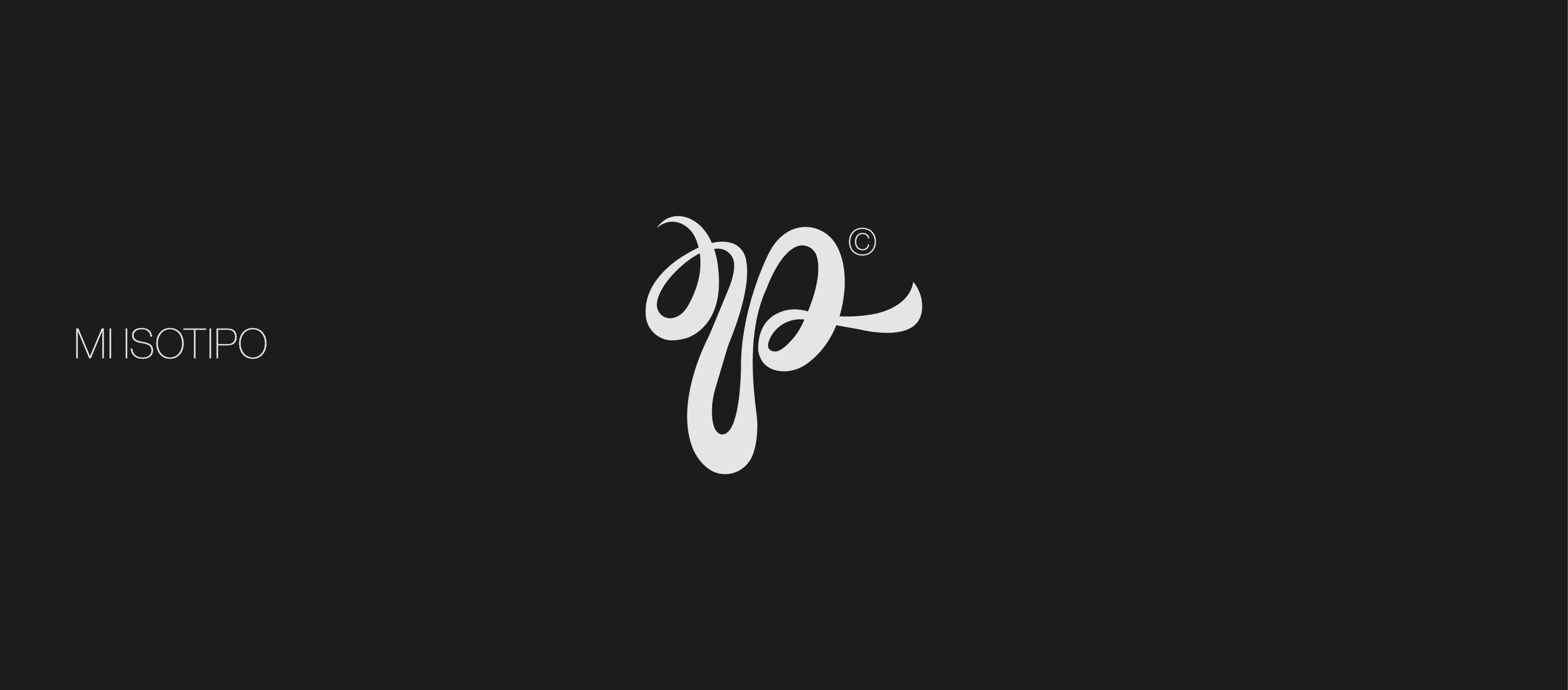
Myself
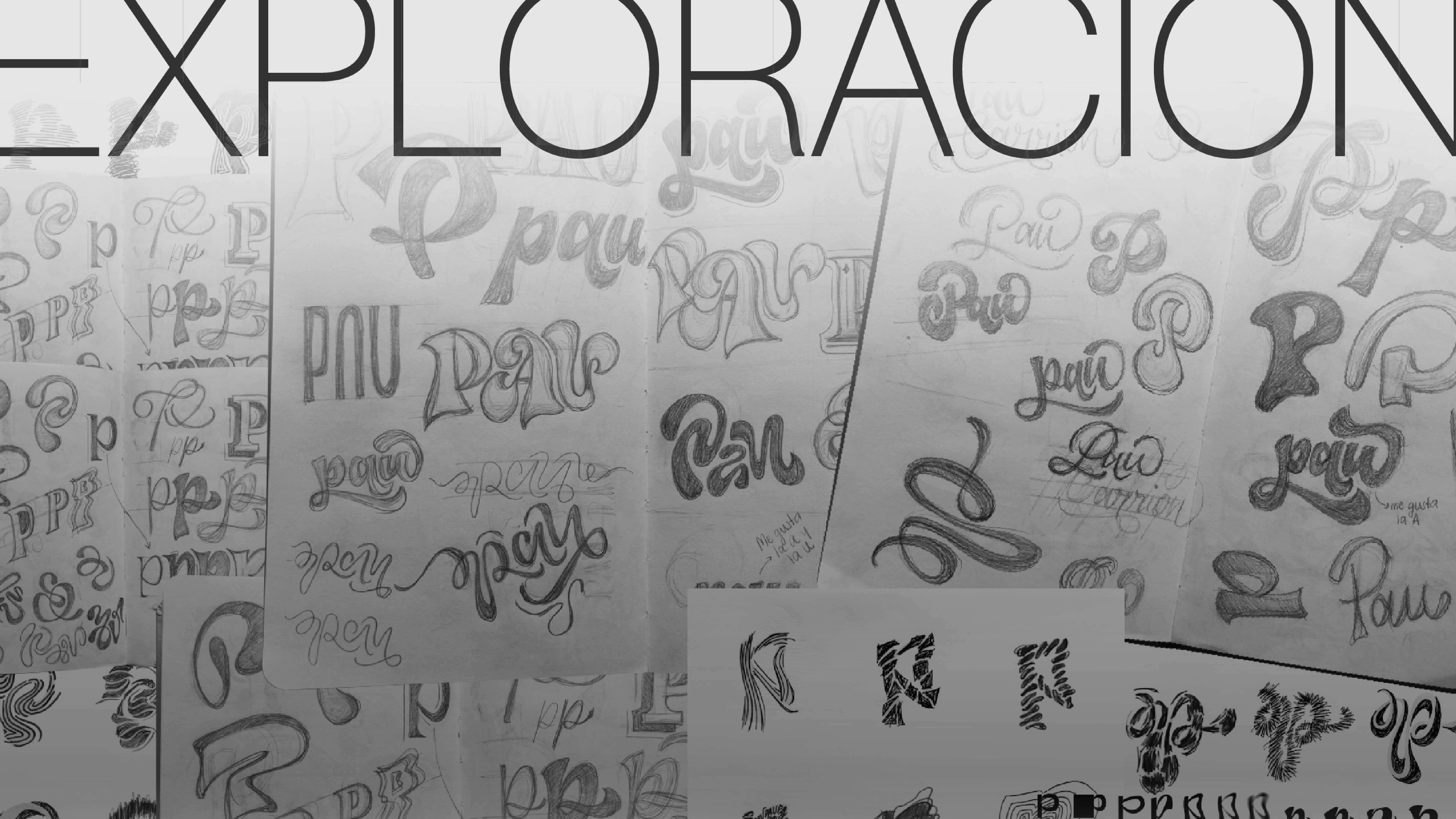
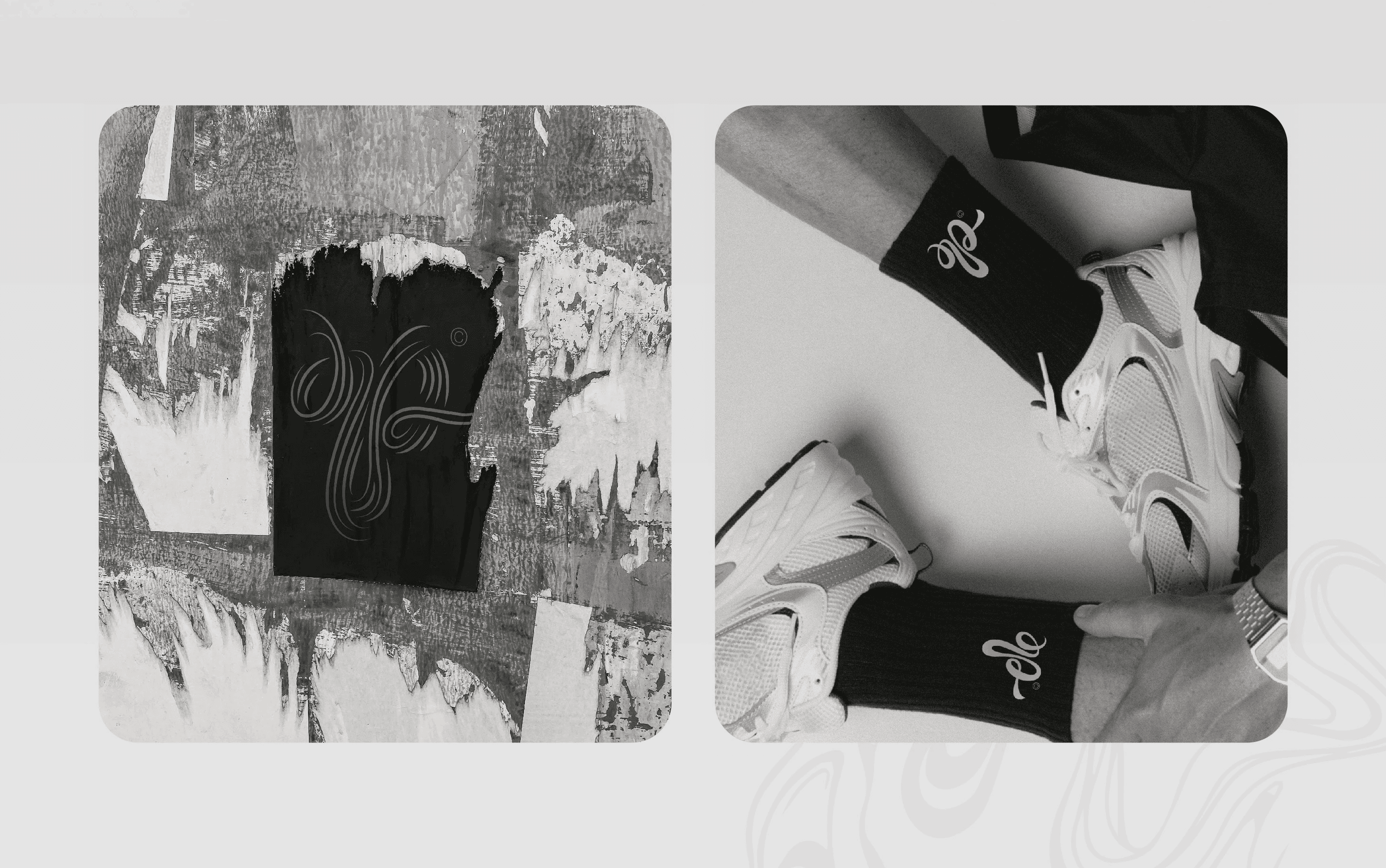
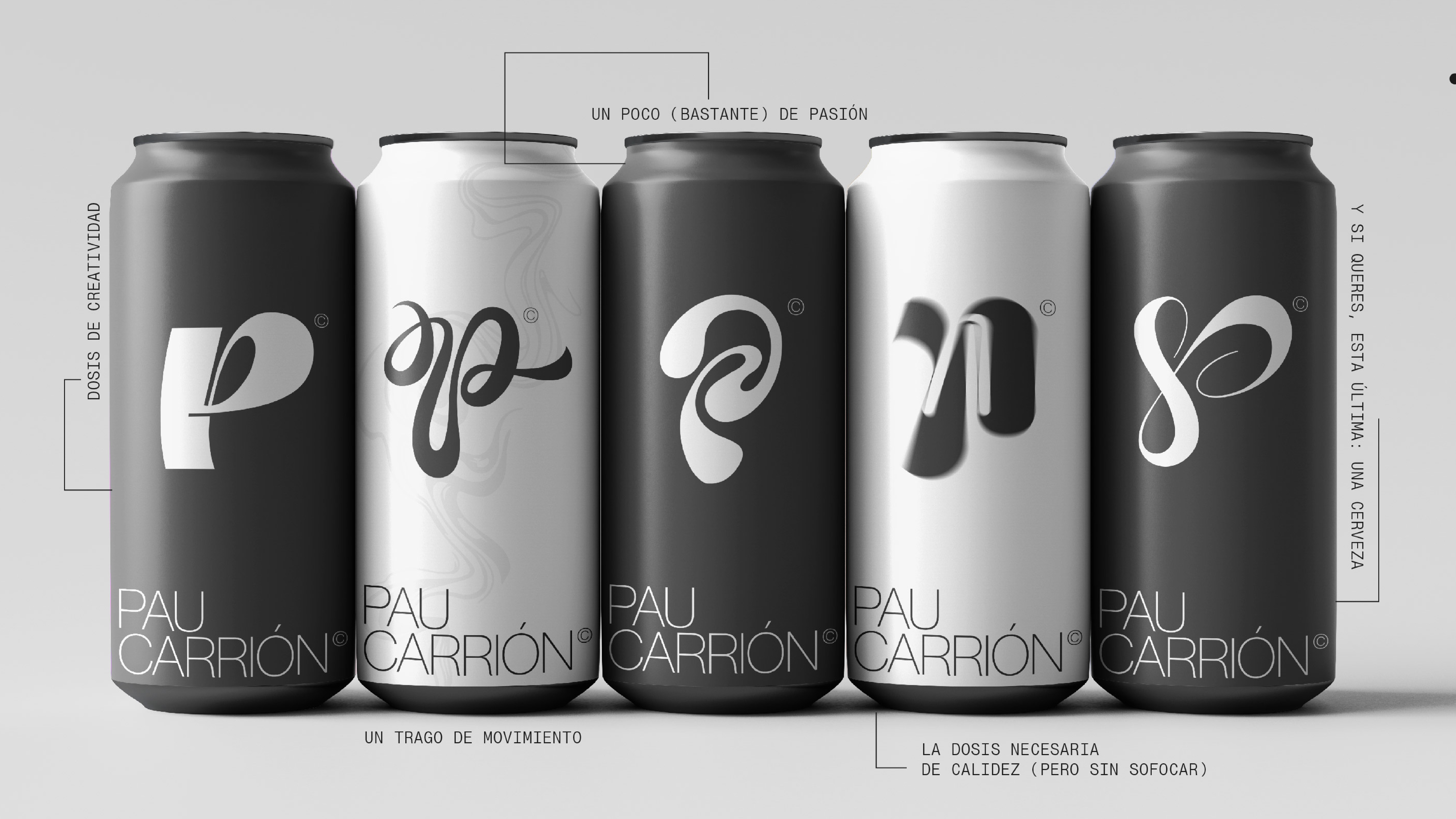
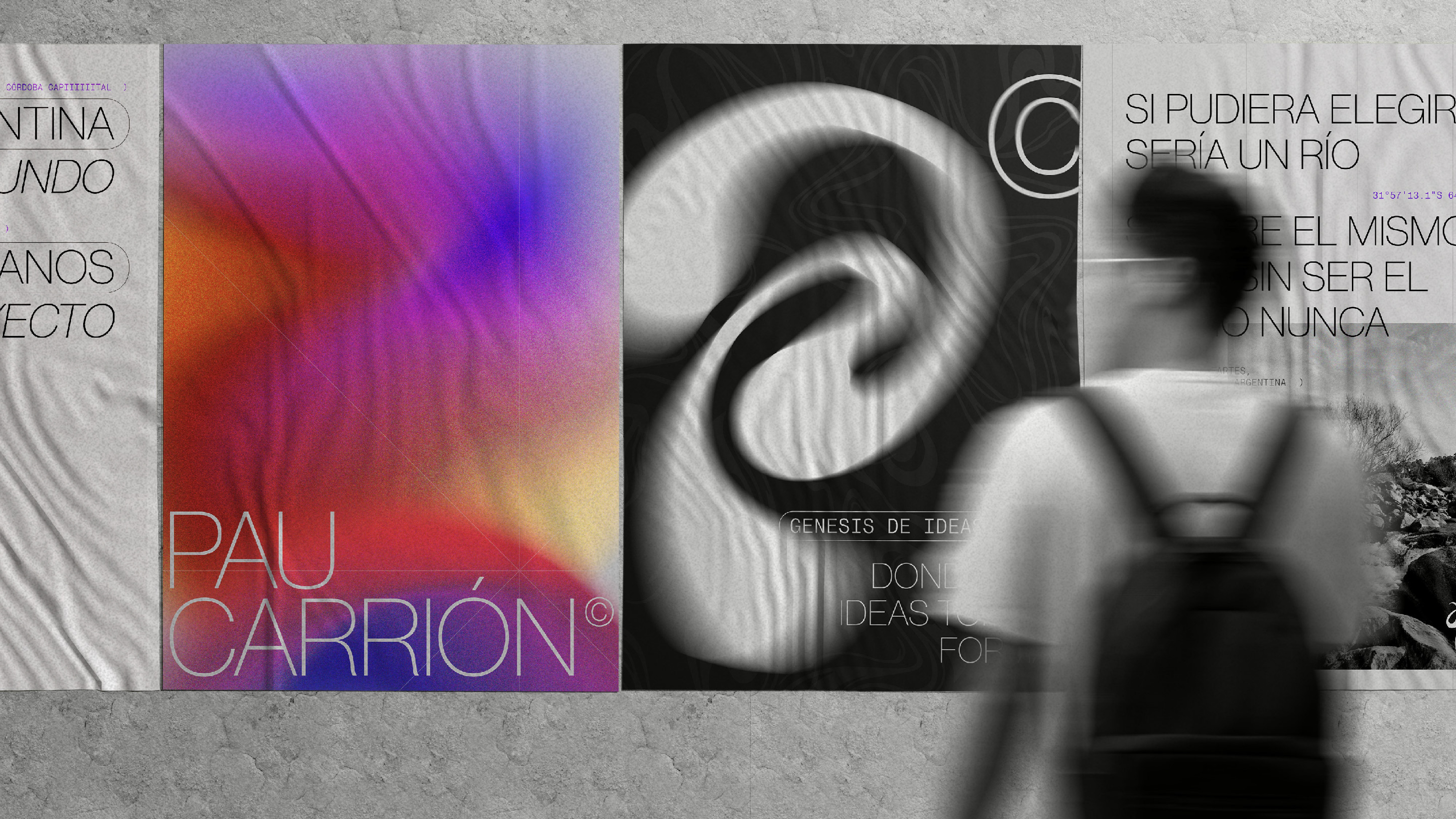
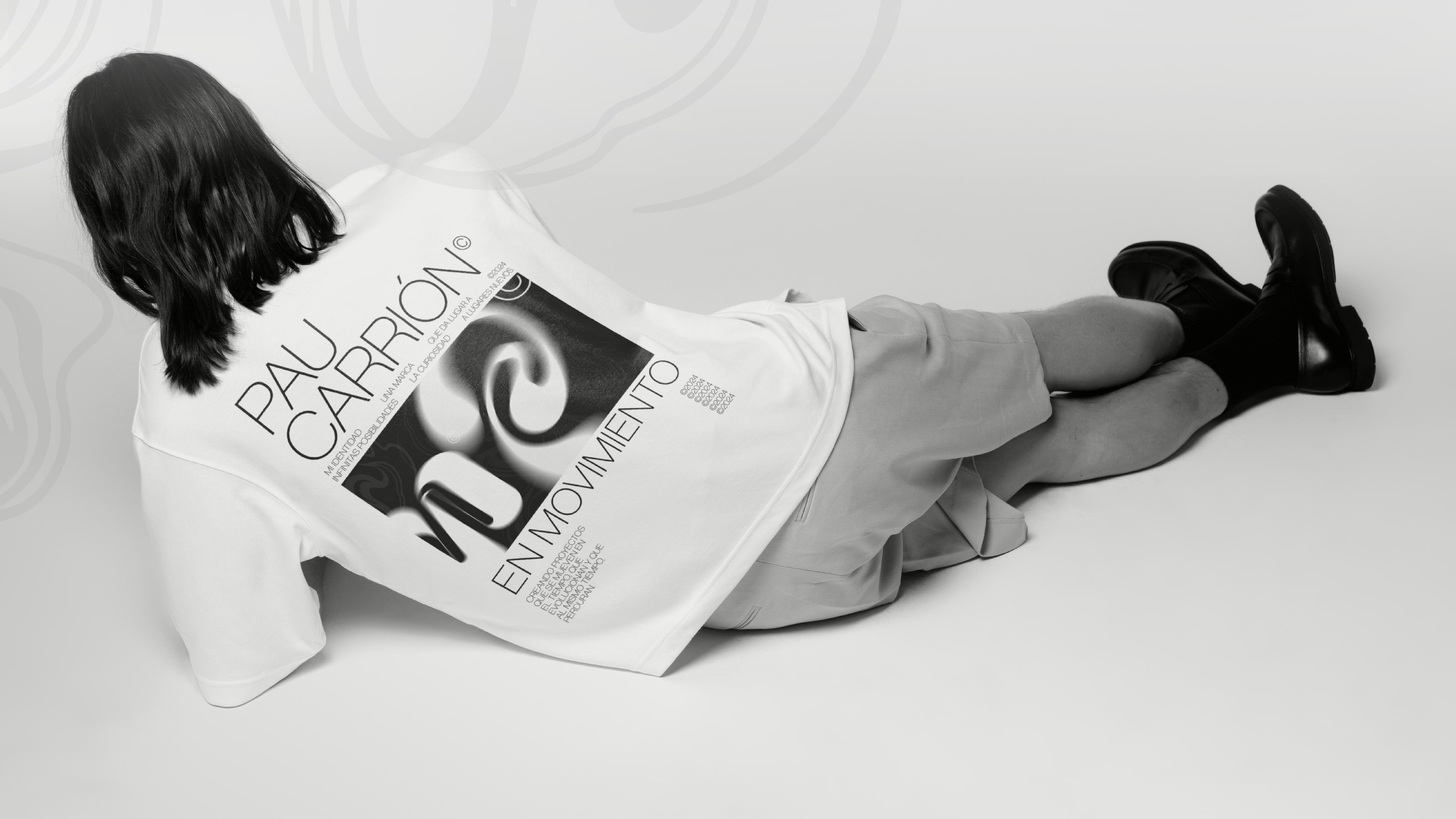
My personal branding project is deeply rooted in typographic exploration. At its core, the identity proposes a flexible isotype built around the letter “p”, which transforms across different styles while remaining a recognizable and unifying element. This variability reflects both curiosity and adaptability—key values that guide my design approach.
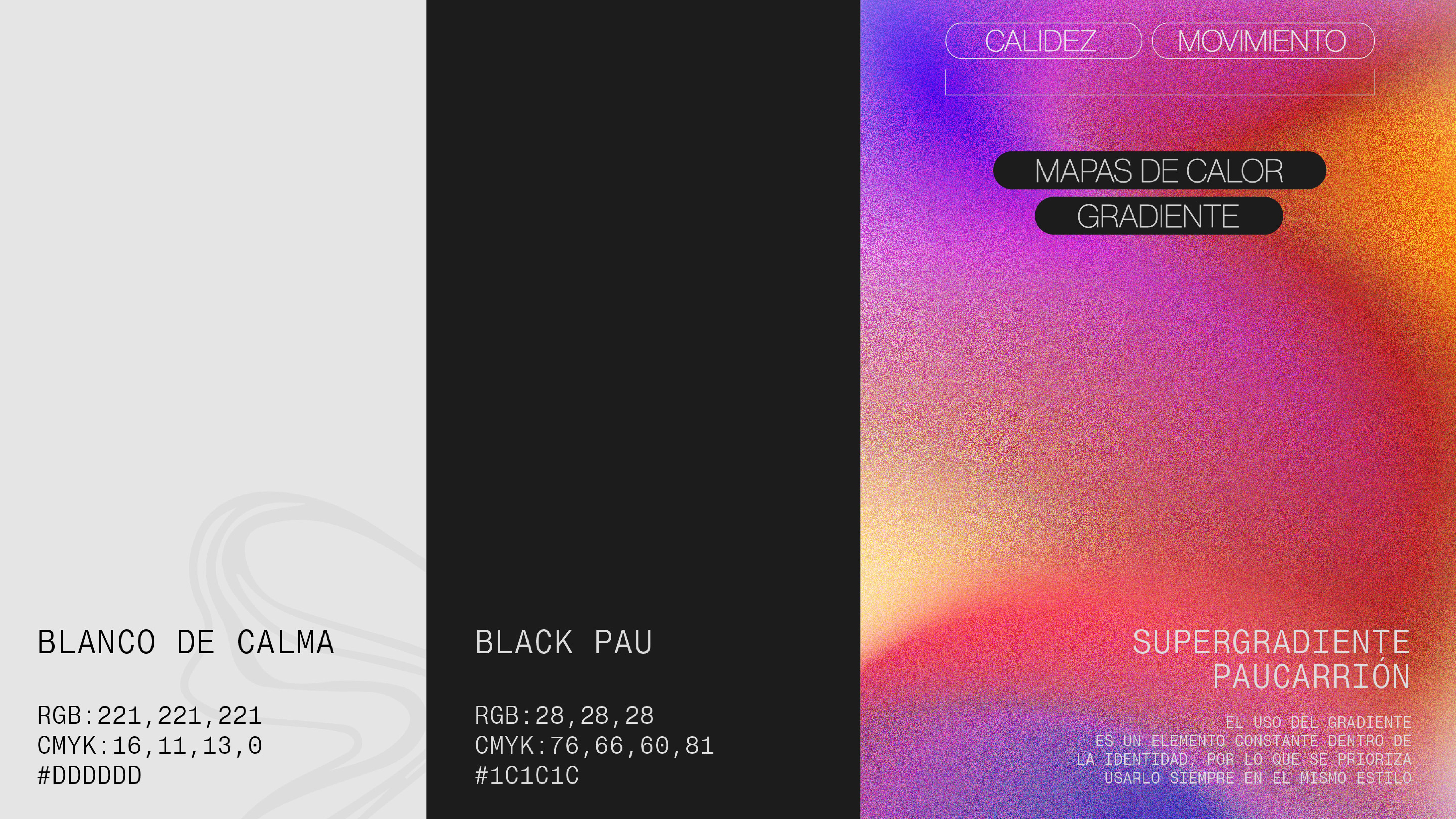
The system is supported by a bold black-and-white aesthetic that emphasizes clarity and timelessness, while the logotype remains constant in Neue Montreal, anchoring the brand with consistency and balance. The result is a visual identity that feels dynamic yet cohesive, celebrating typography not only as a design tool but as the very foundation of my creative expression.